01 The problem
Choosing where to live in North Texas means comparing eighty-odd municipalities on things a listing never shows you: which elementary school your address actually feeds, what the tax rate does to your monthly payment, whether the commute is thirty minutes or fifty-five at 8am.
National platforms spread thin across 30,000 cities with shallow data and infrequent updates. Nobody was going deep on one metro.
The MLS is the menu. Nobody was printing the nutrition label.
02 One score, always decomposable
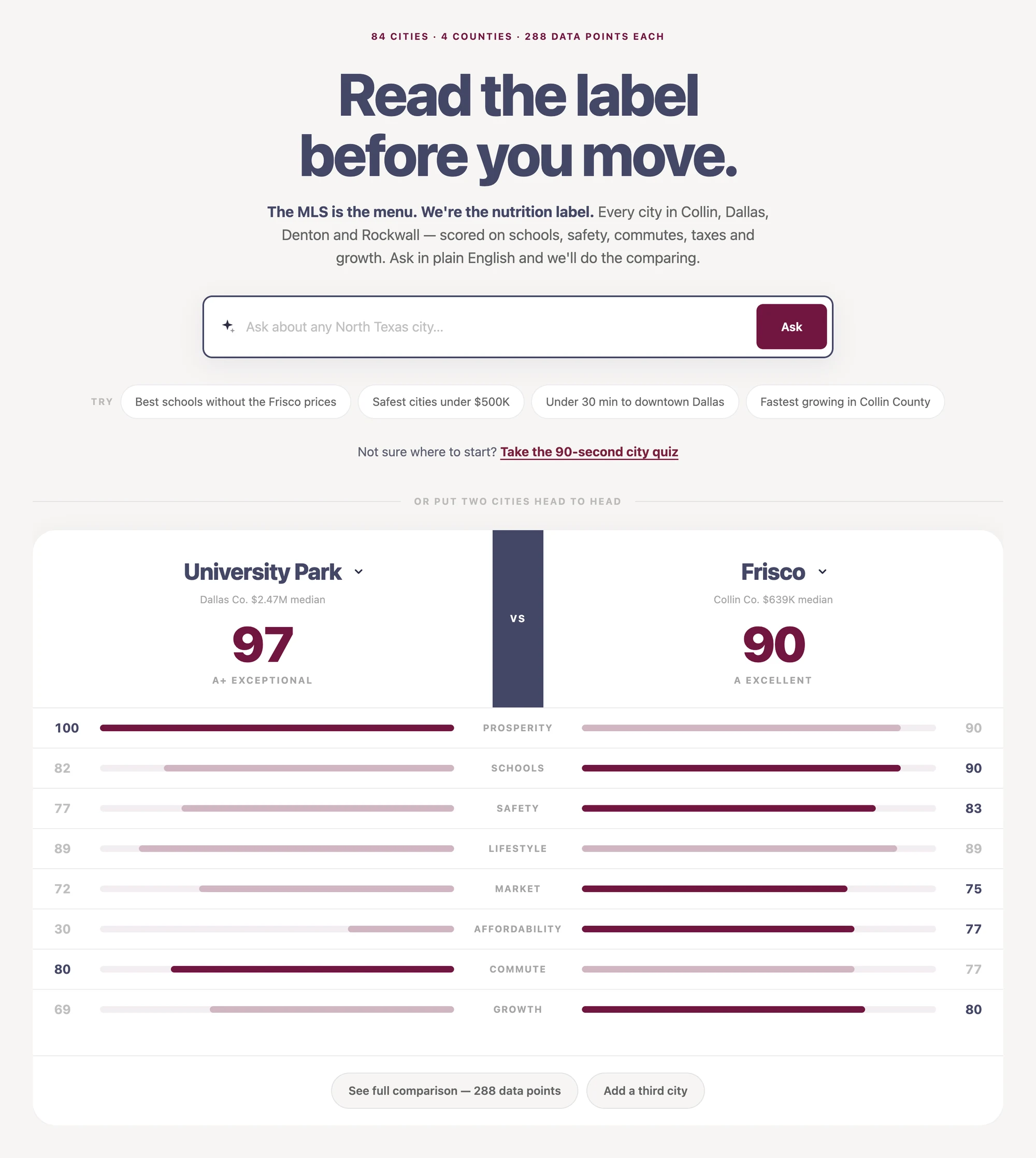
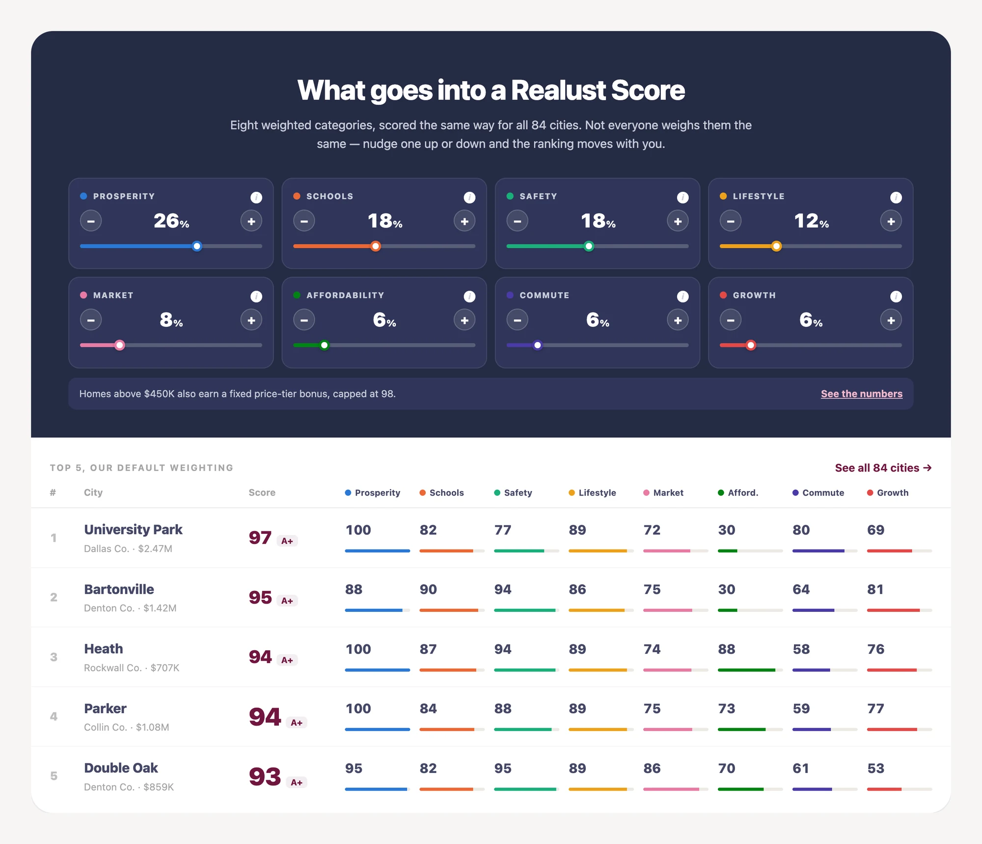
Eight dimensions — prosperity, schools, safety, lifestyle, market, affordability, commute, growth — each normalized onto a shared 0–100 scale, then weighted into one number.
The design decision isn’t the composite. It’s that the composite always decomposes. A single score is cheap to render and easy to distrust; showing the parts turns an opinion into an argument someone can disagree with specifically.
Missing data scores 50, never zero. A city without a walkability figure isn’t a bad city, it’s an unknown one. Scoring absence as failure is the most common way these models lie.
No city scores 100. A single category can max out, but the composite is capped at 98. A perfect city invites the question of what perfect means, and there isn’t a good answer.
The price adjustment is shown, not hidden. Median price signals desirability the eight dimensions systematically under-read, so there’s a deliberate thumb on the scale. It started as a comment in the code. Now it prints on every city page as its own line.

03 The pipeline that feeds it
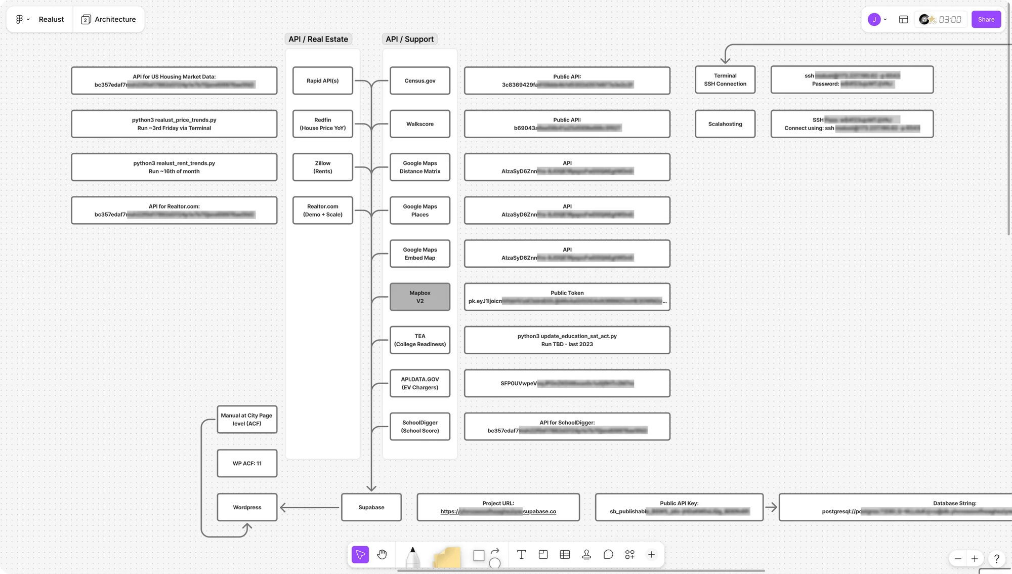
Twelve APIs — census, schools, crime, tax, commute, walkability, EV infrastructure, college readiness, rents, price trends — normalized into 288 fields per city across 84 markets, refreshed weekly.
Some run on a schedule. Some are Python scripts on a calendar. Eleven fields are still entered by hand at the city level, which the diagram labels rather than hides.
04 The human still in the loop
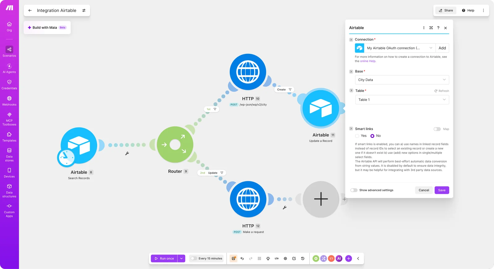
Every AI case study claims a clean autonomous pipeline. Here’s what one actually looks like halfway through being built:
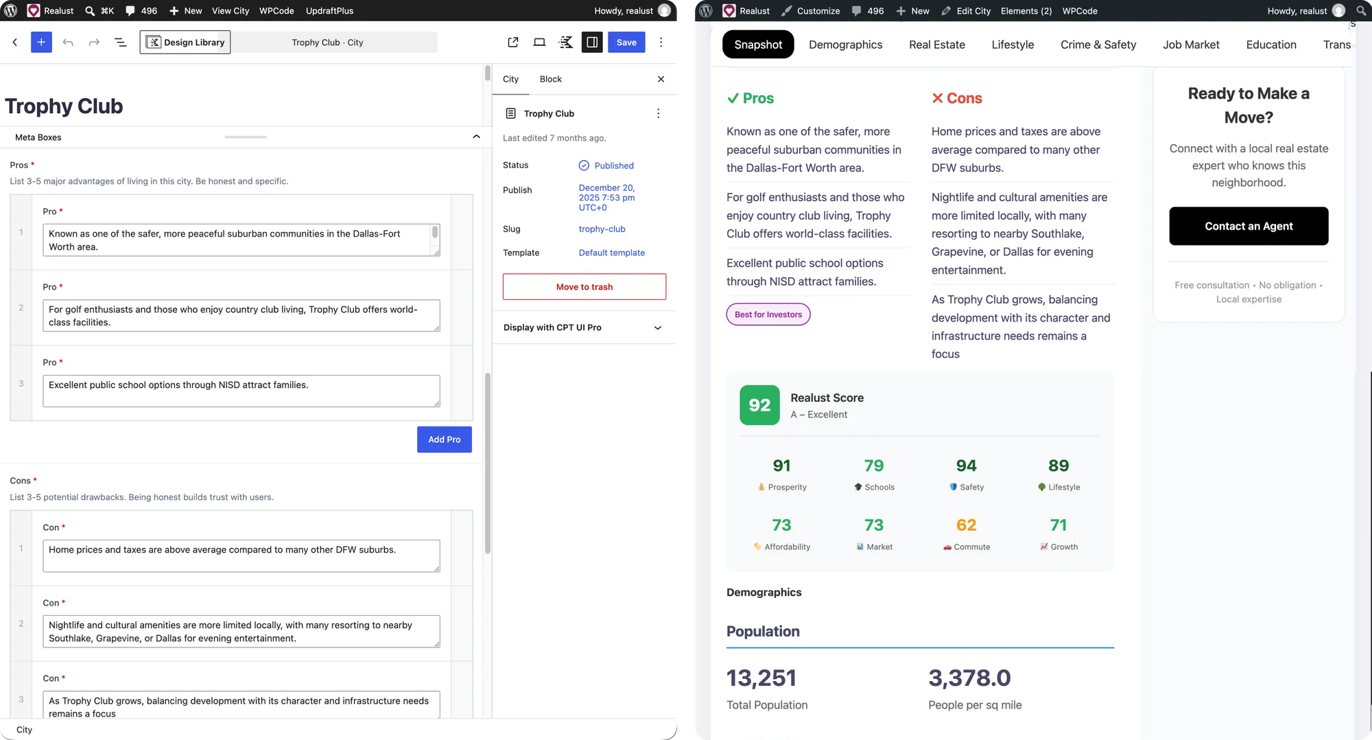
An employee writes a prompt. Pastes the result into a Google Sheet. A process picks it up, writes it into the linked WordPress field, and republishes. A person is still the runtime.
We’re removing that person one step at a time — which is slower and less impressive than a diagram, and it’s the honest version. The field instructions do real work in the meantime: “List 3–5 potential drawbacks. Being honest builds trust with users.” A prompt written into the schema is a design decision, not a technicality.
05 Different doors for different questions
City pages answer “tell me about Plano.” Visitors are asking “where should I live?” Those are different questions and I built the wrong one first.
So the live site has several ways in, each answering a different version of that question.
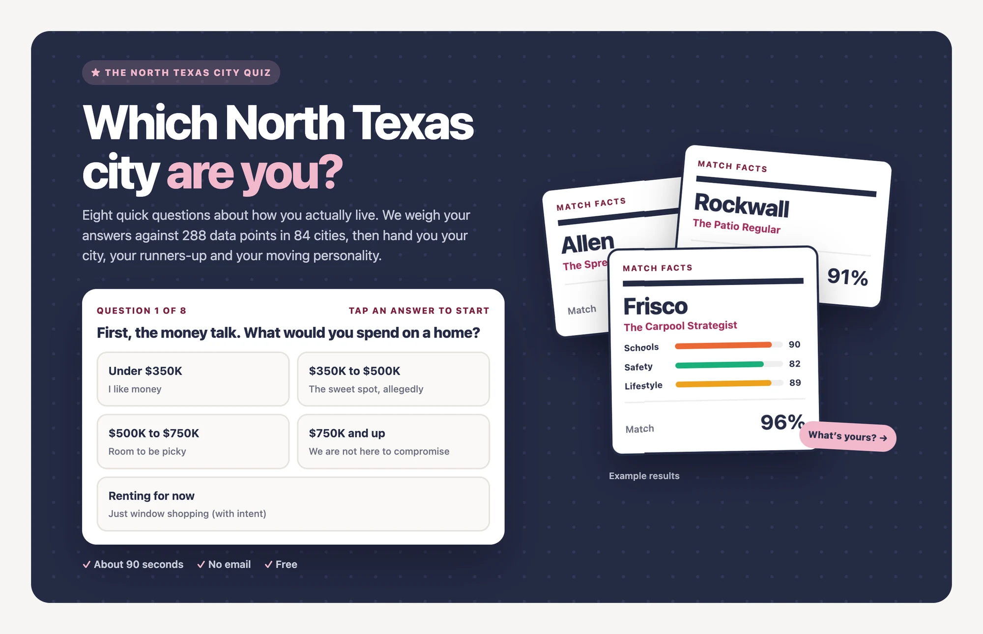
Eight questions about how you actually live re-weight all 288 data points and return a city, three runners-up and one of eight “moving personalities.” No email gate. Couples can send a link to their partner and see the city where they meet in the middle.
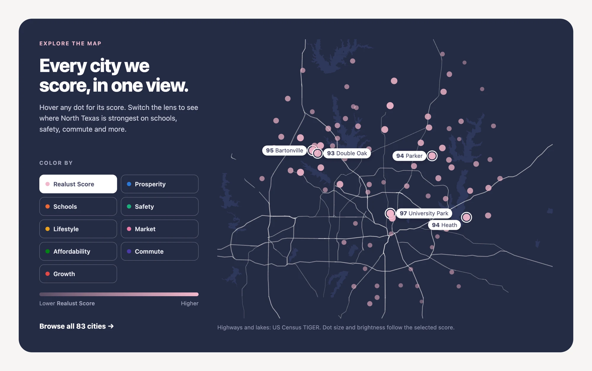
Every city as a dot, shaded by the overall score or by any single category, so a buyer who only cares about commute sees a different North Texas than one who only cares about schools.
Most mortgage calculators stop at principal and interest. In Texas, property tax depends on the city, county and school district, so this one adds up every taxing unit for the address, applies the homestead exemption and lets you compare cities side by side — or work backward from a budget.

Rendering a number is deterministic. Interpreting a request isn’t. The open questions are all about what happens when the model is uncertain: how much reasoning to expose before it becomes noise, what to show when nothing matches, how to signal confidence, and what a wrong answer looks like when the user needs to correct it.
Head-to-head comparison is the same feature with a different interface — and it’s the one that makes the scoring model legible, because you can see exactly where a higher-scoring city loses.
06 Where it stands
Built end to end by directing AI rather than writing every line — the same leverage question as a design system, applied to code. Since launch it has added adjustable weights, the quiz, the map, the true-cost calculator, a momentum score that tracks where each market is headed, three-city comparison, and saved cities. See it live →
07 What I'd do differently
I built it backwards. Normally I start by making a thing look right and work outward. This started with the pipes — APIs, scoring, database — and the front door came last. The data layer was solid for months while the homepage still said “Campaing.”
That order isn’t wrong exactly. It meant the product was real before it was presentable, which beats the reverse. But it also meant anyone who visited during that window judged it on the wrapper, and they were right to.
My own site contradicted itself. The homepage claimed 130 cities while the data said 84. Two numbers on one site and I never checked them against each other — the exact failure I’d catch immediately in someone else’s work.
What I’d keep: deciding early that every score decomposes. It constrained the interface in useful ways and it’s the thing that makes the product arguable rather than authoritative.