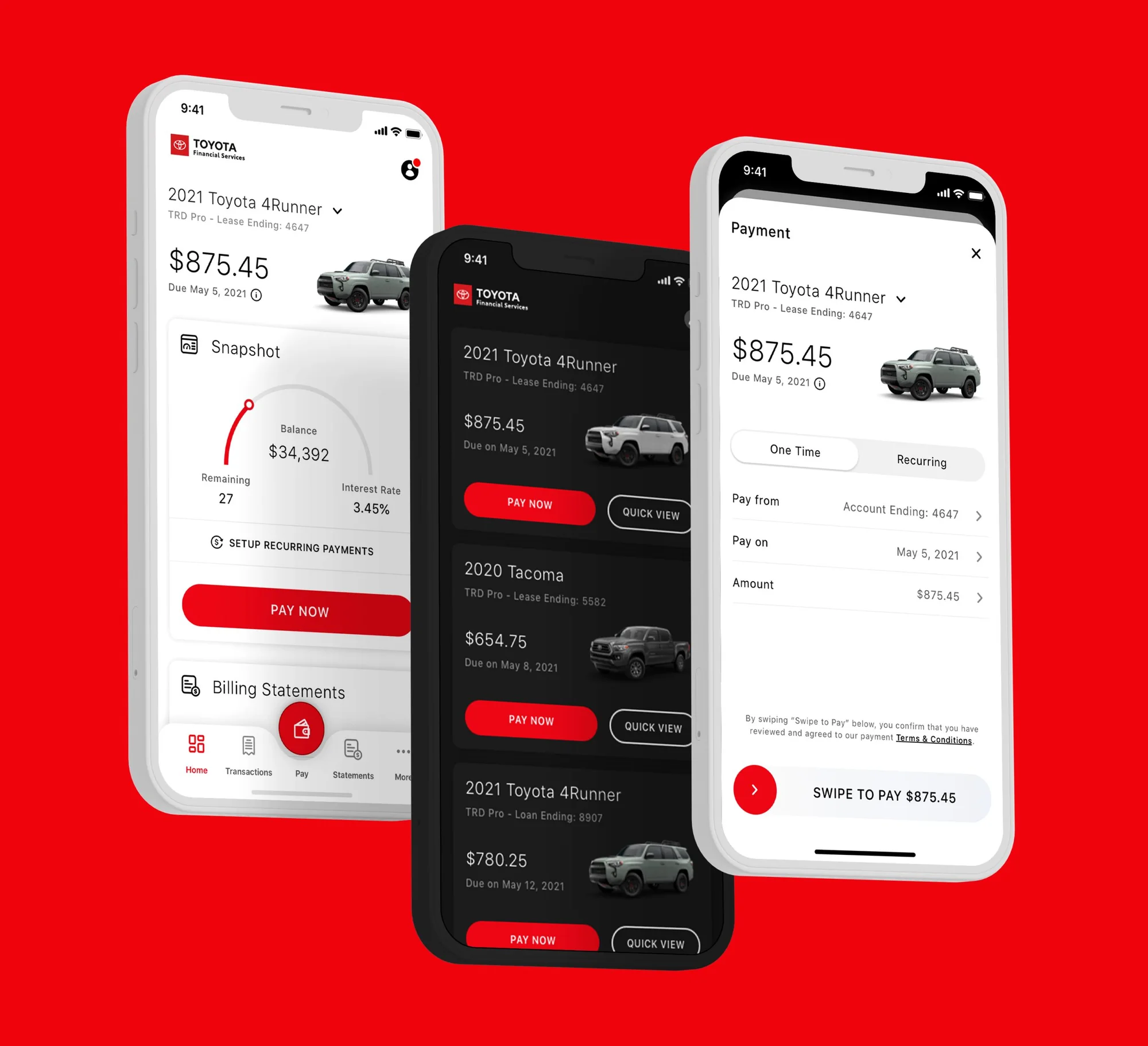
What I owned: client lead for Toyota Financial Services; the user research and competitive analysis; hands-on UX and UI for payments, swipe-to-pay and vehicle management; and direction and review for the design team.
01 The problem
Photon is the digital agency behind 37 of the Fortune 100. Work arrives as an embedded engagement: you join a client's team and inherit their constraints, their legal review, their release train and their existing app — then you're expected to move faster than their internal team could.
The Toyota app sat at 2.6 stars. That number isn't a design critique. It's a thousand small frustrations left in place because nobody owned the whole surface.
02 Toyota, Lexus and Mazda
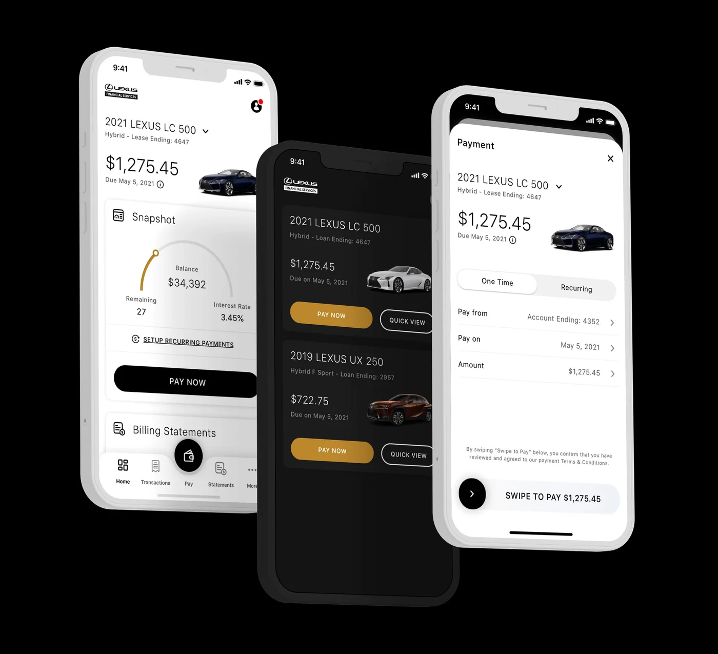
Three automotive brands, one platform problem. We ran user research and pulled data from in- and out-of-industry products to identify pain points, then used competitive analysis to establish a baseline worth beating.
What shipped: a user can complete payments, see exactly where they are in a lease or purchase, and manage every vehicle they own from a single app — each with a full transaction history. The App Store rating moved from 2.6 to 4.8 and the app is still live.
Static screens don't capture what actually took the time. Swipe-to-pay had to feel deliberate enough that nobody sends money by accident, but light enough that it doesn't feel like a chore. Reordering vehicles had to work one-handed, in a driveway, in sunlight.
Prototyped in Flinto. The swipe-to-pay threshold went through four rounds before it stopped feeling either twitchy or sluggish — too light and people pay by accident, too heavy and it feels like a chore.
03 Mobile, web and watch
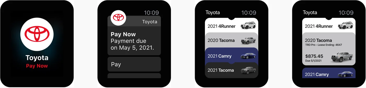
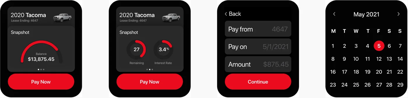
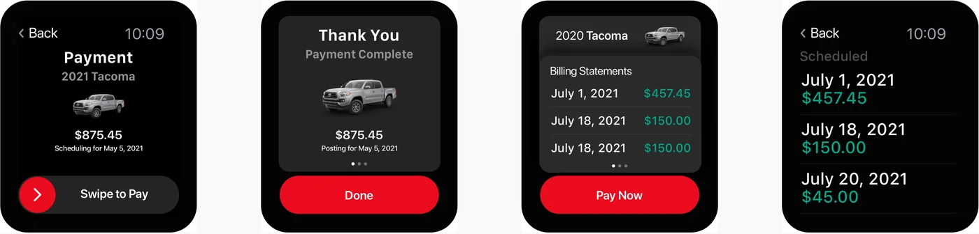
The same payment flow had to survive a 40mm screen. On a watch there is no room for reassurance copy, so the confirmation has to come from the gesture itself — swipe to pay, then a screen that does nothing but confirm it worked.
Scheduling, billing history, and switching between vehicles all needed to work in glances rather than sessions.
Directing twelve designers taught me the same lesson as building a design system: your leverage is the decisions you make once, not the ones you make repeatedly.
04 Leading distributed
At peak I directed a team of up to twelve across multiple time zones. You cannot review everything, so the job stops being design review and becomes writing down the decisions that make review unnecessary.
Standardized: component naming, redline conventions, and one weekly critique anyone could bring anything to. Deliberately left loose: visual exploration. Constraining the wrong half of the process is how agencies produce work that looks like it was made by a committee.
05 What else shipped
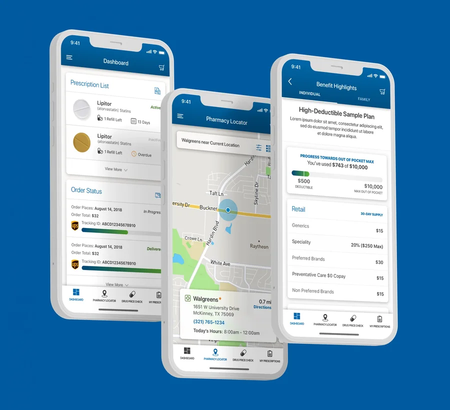
Overhauled the native apps and added e-commerce that lets a user shop several vendors at once, sorted by delivery time and shopping preference. Pharma regulatory review means every claim on every screen has a legal owner. It's slow, and it makes you precise.
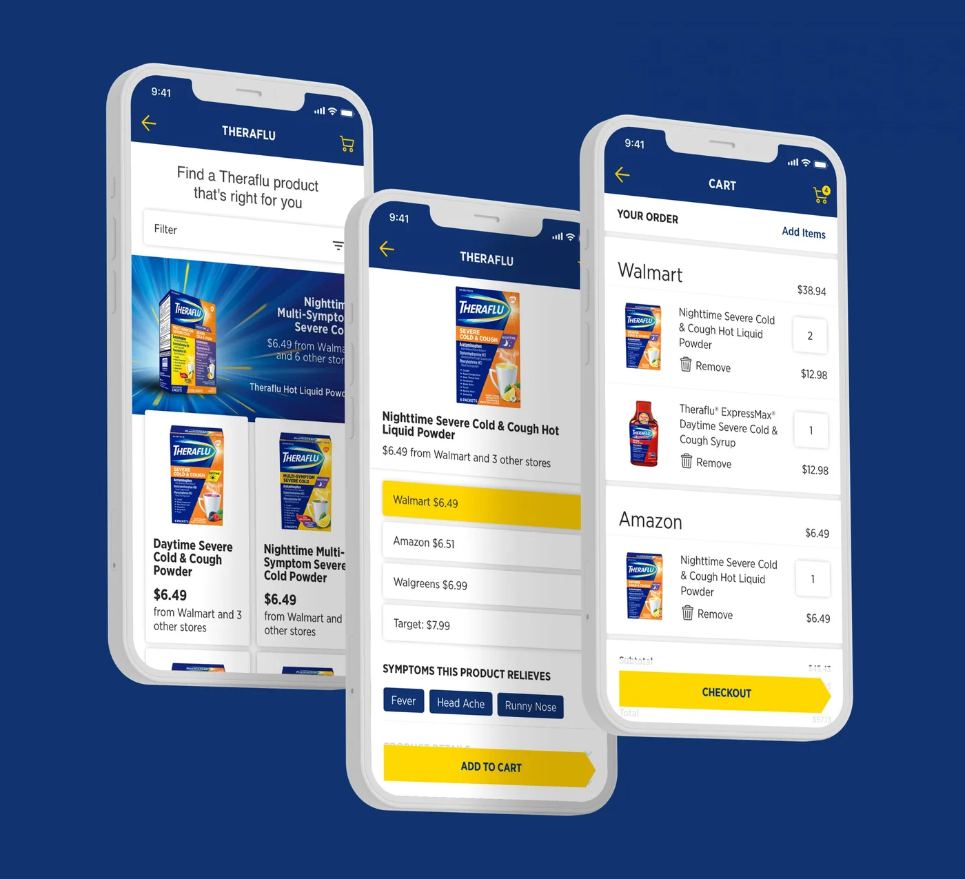
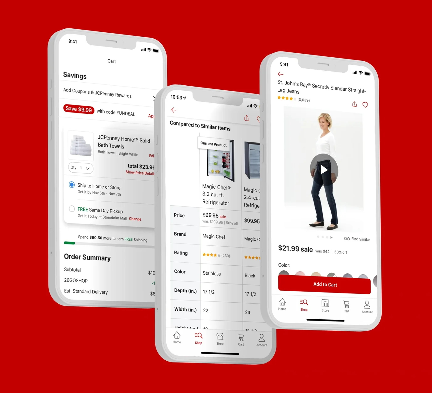
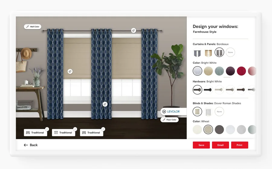
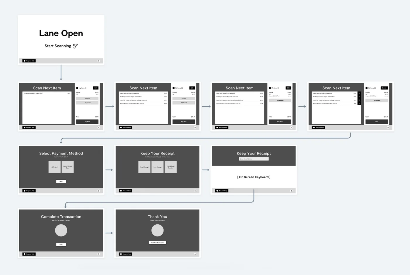
Ongoing native app work — research and testing shortened flows throughout. Then two pieces of retail hardware: an in-store kiosk built from scratch where a customer mixes and matches from bedding through drapes, prints their favorites and checks out with an associate; and a self-checkout pilot backed by extensive user testing.
Hardware in a store has constraints software people forget: glare, standing posture, no keyboard, and a queue forming behind you.

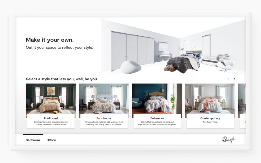
The kiosk configurator. Start with a room, pick a style, then work down to individual pieces.
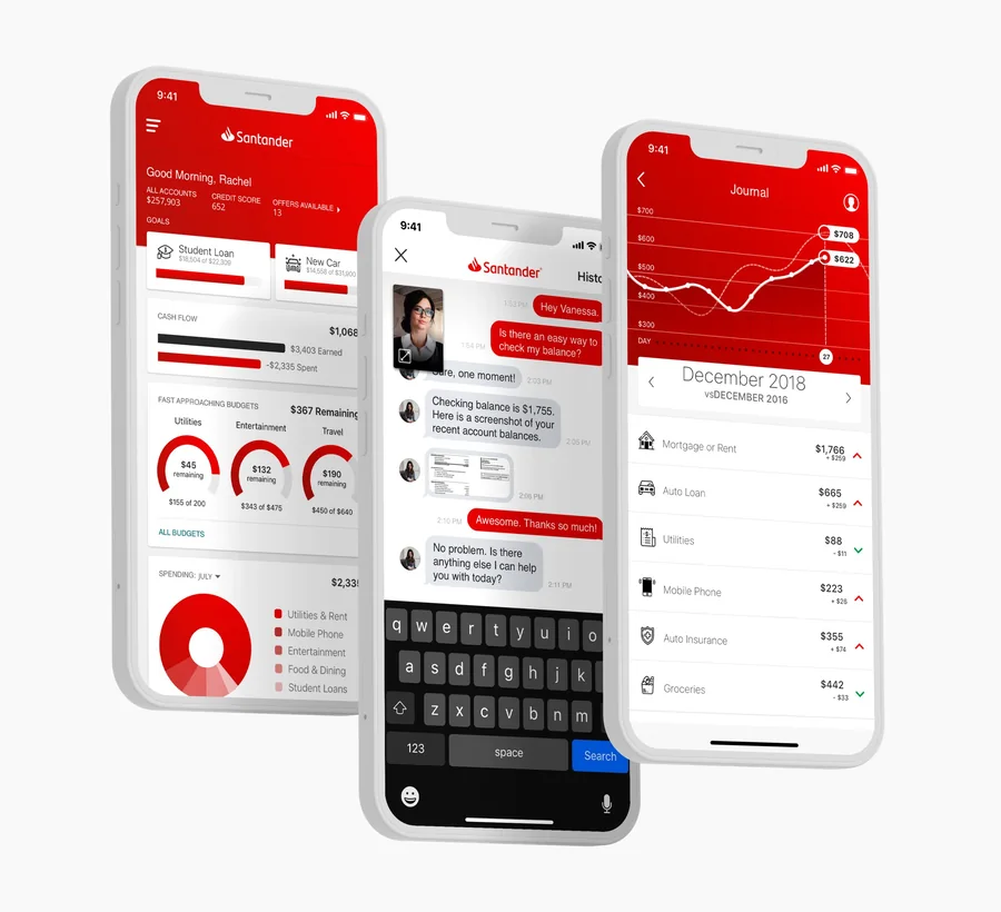
MedImpact: overhauled native apps, adding pharmacy search by specific criteria and detailed drug information. Santander: re-imagined the app around a friendlier dashboard, live chat with agents by text or video, a branch locator, and savings goals tracked alongside everything else.
06 Results
Additional engagements across MetLife, Walmart, L'Oreal, Citi Group, Plymouth Rock, and Wynn Resorts.
07 What I'd do differently
I let visual polish absorb time that belonged to instrumentation. Toyota shipped without agreement in advance on what we'd measure. The rating moved, which is a good outcome you can point at — but I can't tell you which change did the most work, and that's a worse position than it sounds.
I under-invested in written decisions early. With twelve people across four time zones, anything not written down gets re-litigated at 2am somewhere. I now write the decision log before the team scales, not after it hurts.
What I'd keep: a weekly critique open to anyone, with no agenda. It surfaced more real problems than any structured review I've run.