01 Overview
At City Electric Supply I own the design system that about ten products now run on. I built it the hard way, as a cleanup: years of shipping had left the core file full of copies that no longer inherited anything.
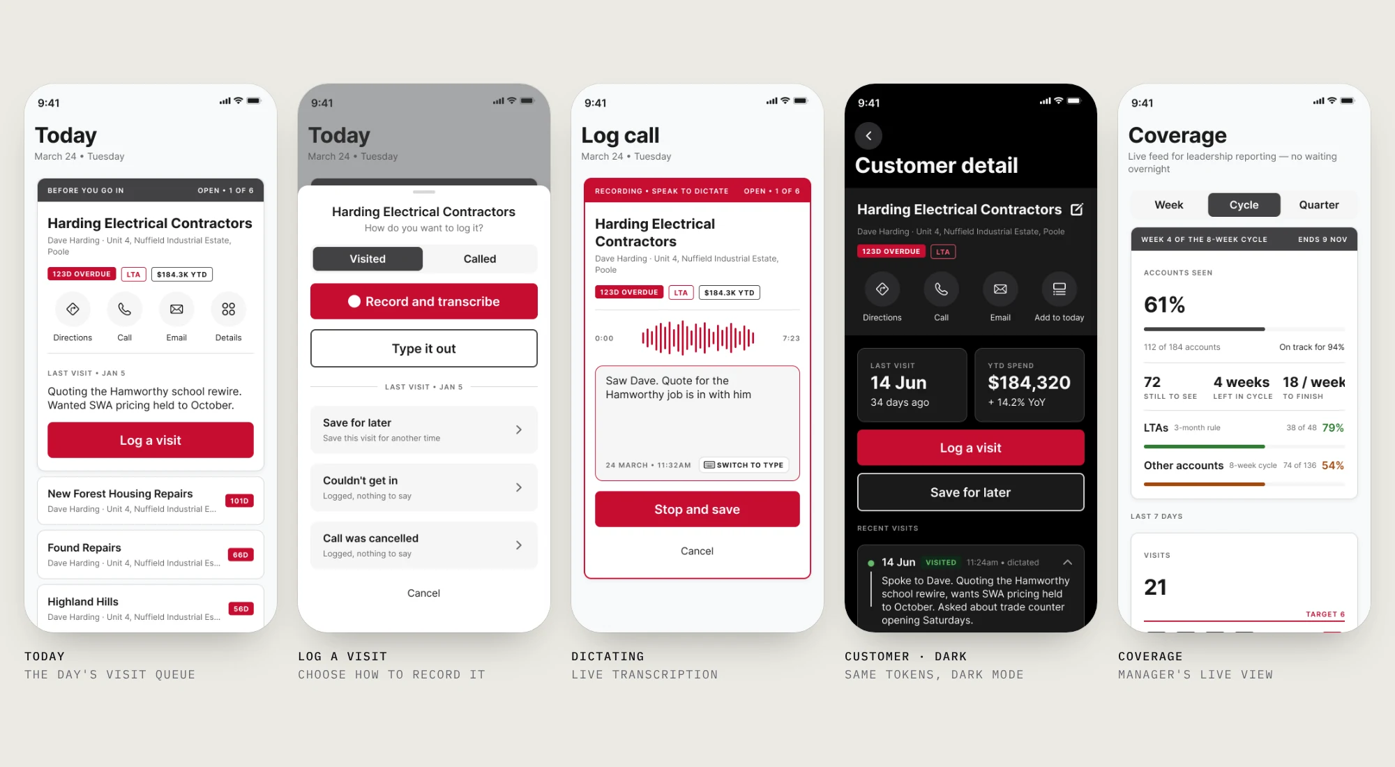
This page follows that system from the cleanup to what it looks like when it starts on day one. I took Diary Manager, a brand-new visit-logging app pitched to a CES field-sales team, and built it as a token-driven system that runs from a single source file all the way into SwiftUI.
A design system isn’t a component library. It’s a decision about who is allowed to change what, and how fast.
02 Where it started
The flagship CES file had 490 layers in a single frame, thirteen untracked groups with names like Rectangle 4 Copy 85, and eleven real components. Everything else was a copy of something that used to be a component. Nobody had done anything wrong; that’s what three years of deadlines leaves behind.
I studied how fifteen mature systems (Stripe, Shopify, Airbnb, Meta and others) handle naming and nesting rather than visual style, then rebuilt one real screen end to end before proposing anything. Layout, hierarchy, components, spacing and architecture, in that order, each holding before the next made sense.
The library went from 80 components to 32 and from 607 layers to 255. It became one core with platform layers that switch on per market, and about ten products now build on it.
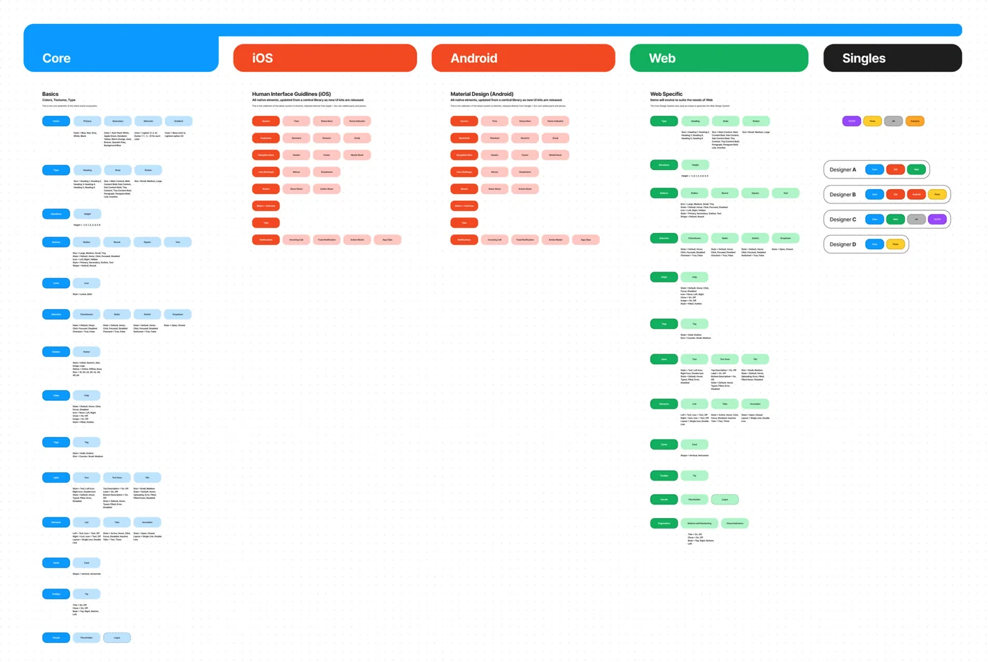
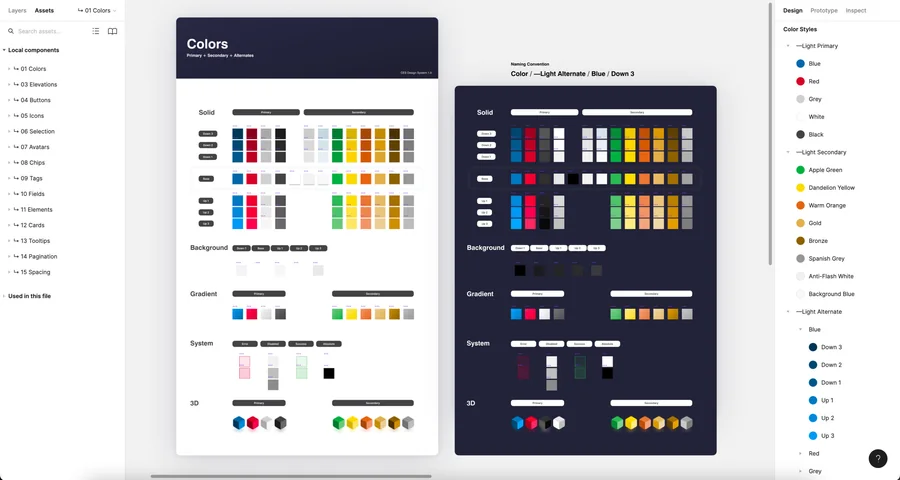
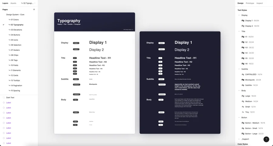
Color and type tokens. Decided once, applied everywhere — the part that makes localization a switch rather than a rebuild.
03 Even a fresh design drifts
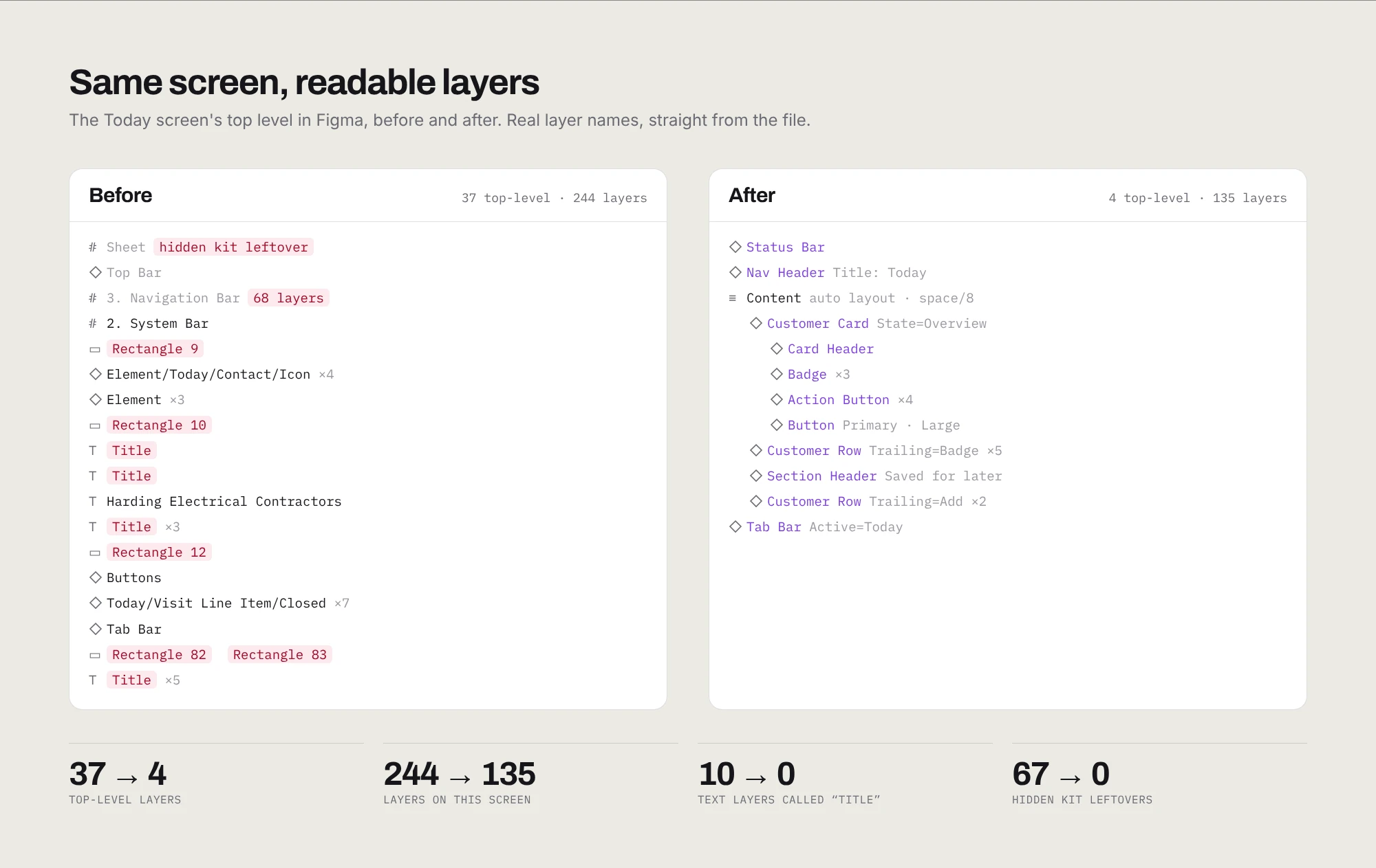
Diary Manager was the opposite case: a polished concept, ten screens, current UI, nothing legacy about it. I audited it anyway, with scripts rather than by eye.
2,125 layers, 294 still named Frame or Group. Only 19% of frames used auto layout. A quarter of the colors were typed in by hand, and the rest pointed at an external library with names like “Spanish Grey.” Three font families, fourteen font sizes, fifteen corner radii. The brand red had been typed 119 separate times.
Same drift as CES, just younger. It’s what happens when the system arrives after the screens instead of before them.
04 One source of truth
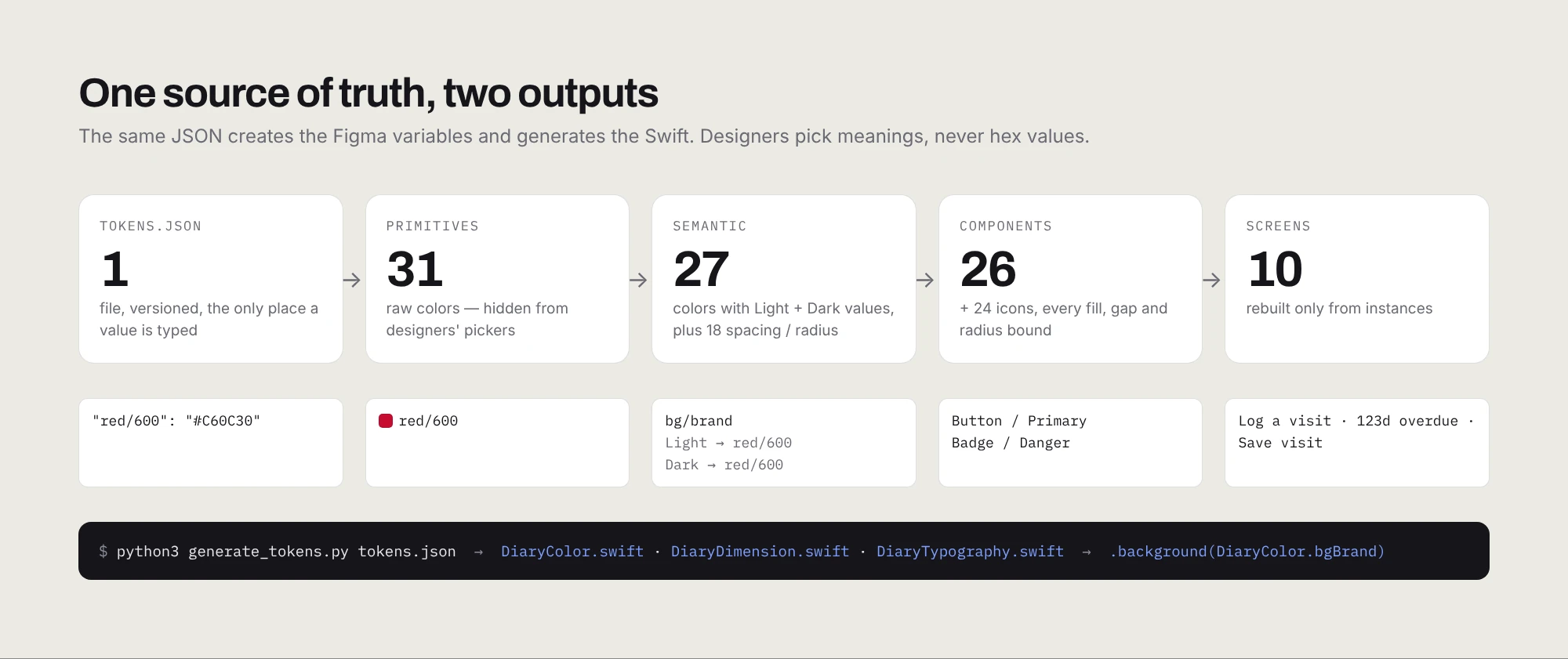
Every value lives once, in a single JSON file. That file creates the Figma variables and also generates the Swift, so design and code can’t quietly drift apart.
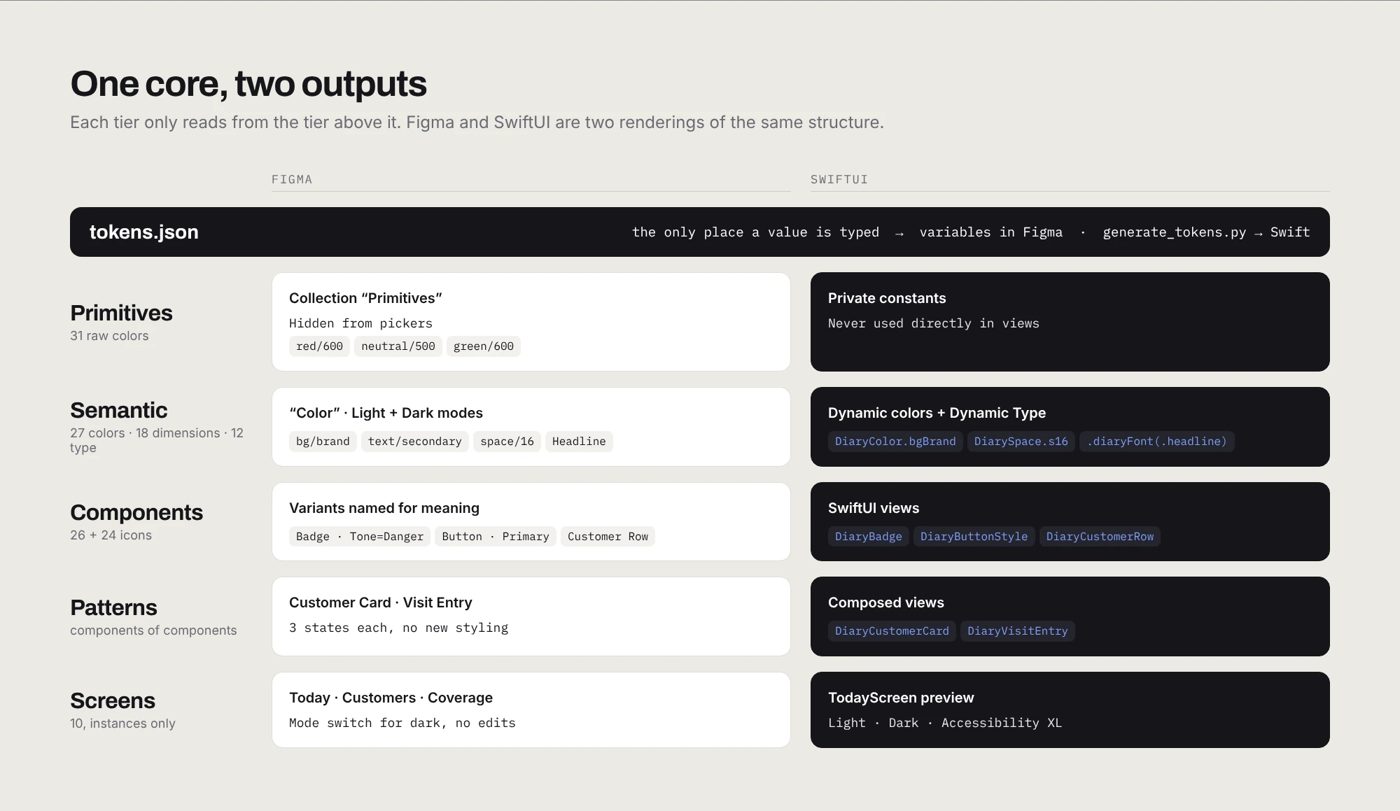
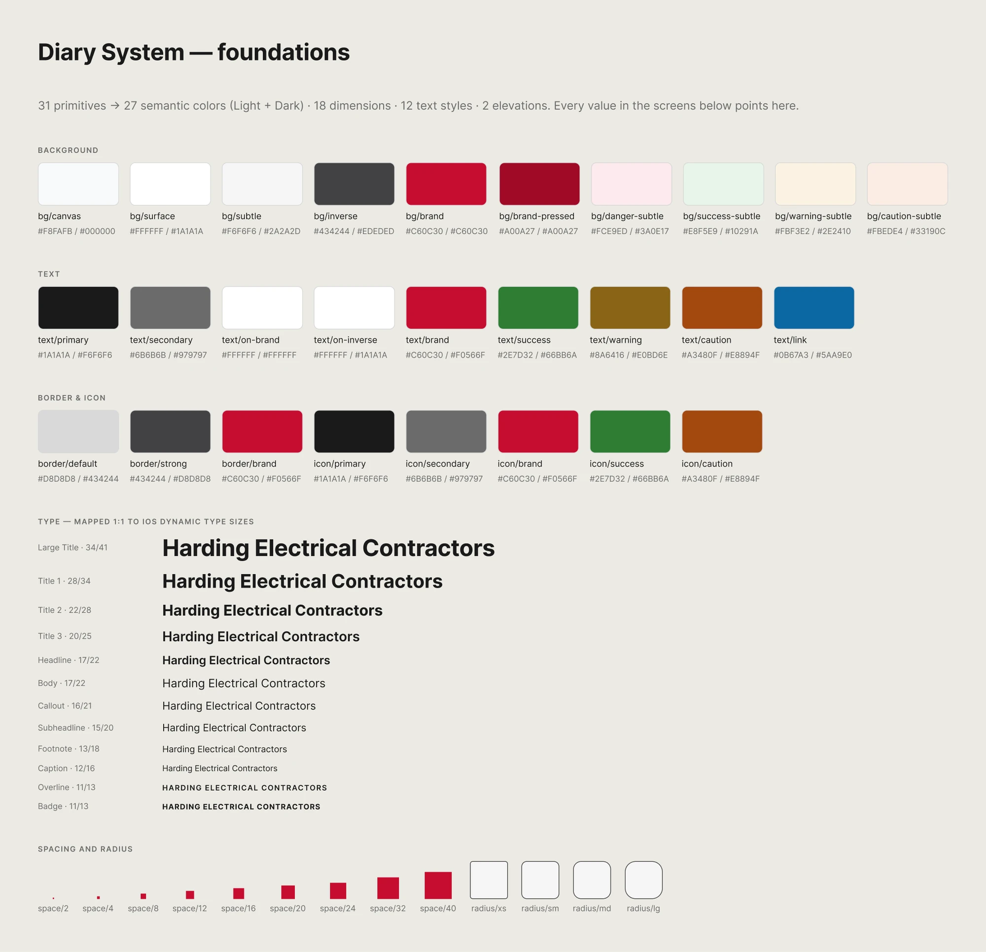
Primitives are the raw colors, hidden from the picker so nobody reaches for a hex value. Semantic tokens say what a color is for (bg/brand, text/secondary) and carry a light and a dark value. Components bind to semantics only. Type maps one to one onto iOS Dynamic Type sizes, so when someone turns their phone’s text up, the app follows.
05 Components
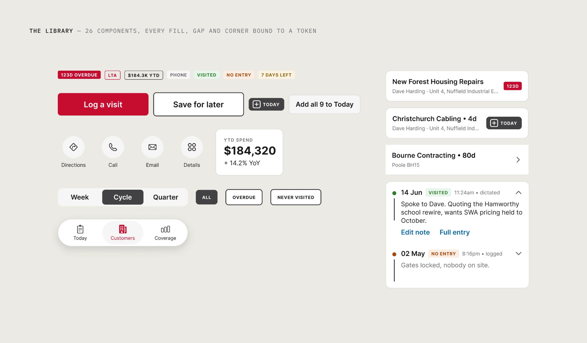
Twenty-six components and twenty-four icons cover all ten screens. Every fill, gap and corner is bound to a token, and variants are named for what they mean (Tone = Danger, Trailing = Add), so the name tells you which one to use.
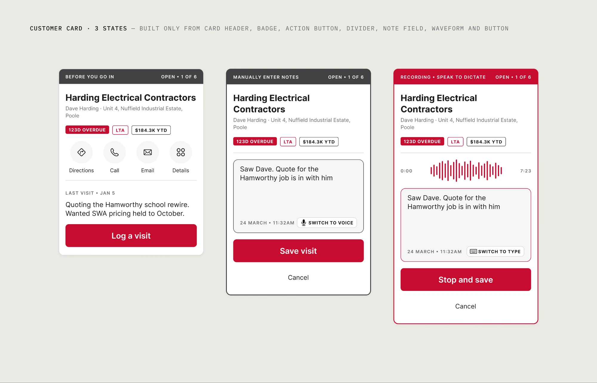
At CES the pilot screen went from 11 components to 16 while total layers fell 26%. That sounds contradictory until you see both numbers together: fewer things, more of them under control. Diary repeats the pattern. The biggest piece, the Customer Card, is made only of smaller components, and its three states are the same parts rearranged.
06 Accessibility, fixed once
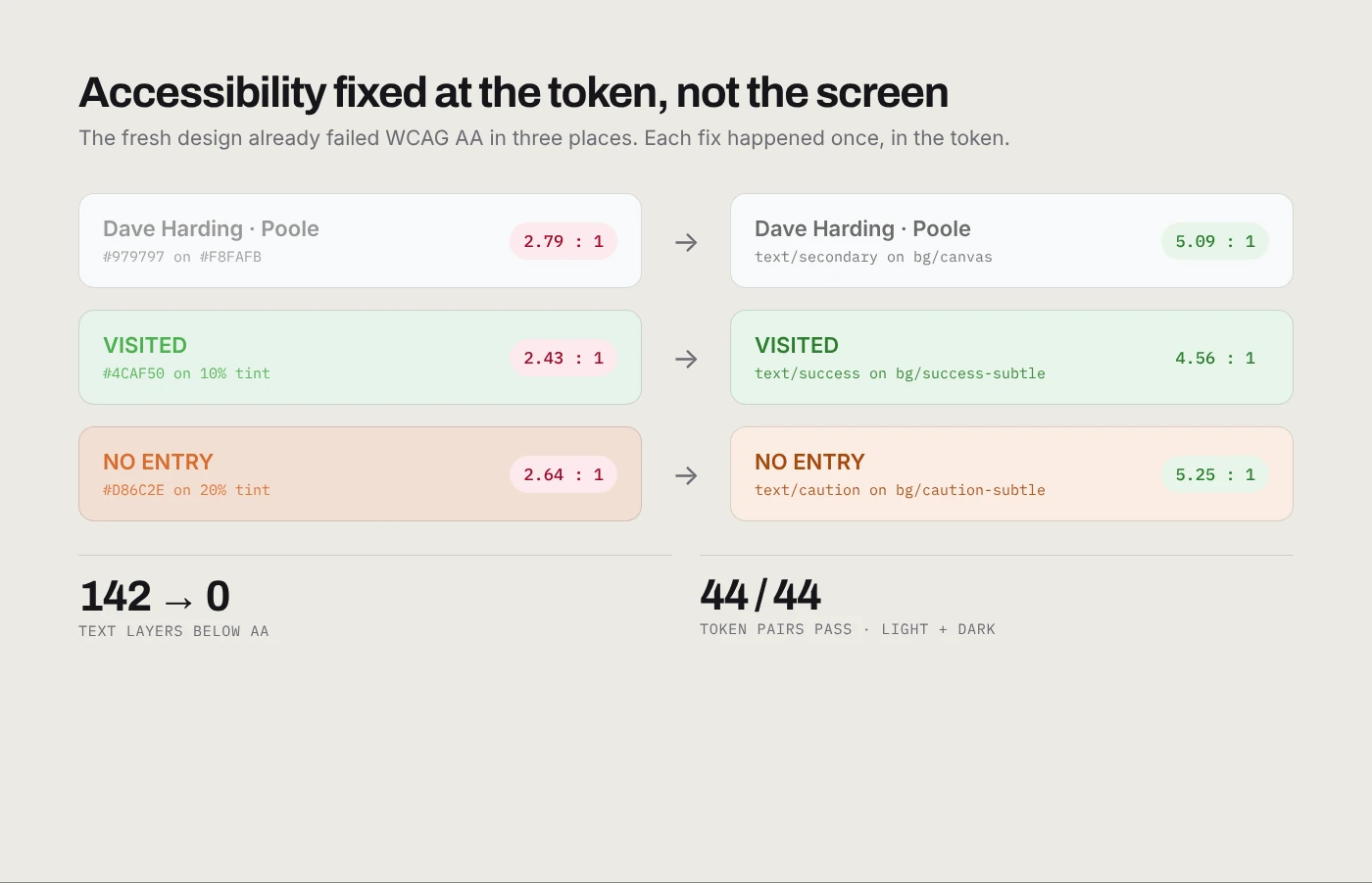
The fresh design already failed WCAG AA in three places: grey secondary text at 2.8:1, and green and orange status labels around 2.5:1. About 140 text layers were affected.
Because every screen reads from tokens, each fix happened exactly once. All 44 text-and-background token pairs pass in both themes, and a scan of the rebuilt screens finds no text below AA.
07 Into Swift
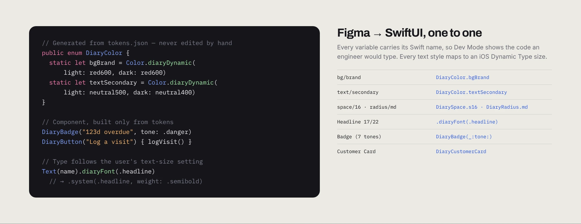
A small script turns the JSON into Swift: colors that switch with light and dark mode, spacing and radius constants, and text styles that follow Dynamic Type. Every Figma variable also carries its Swift name, so an engineer inspecting a button in Dev Mode sees DiaryColor.bgBrand, not a hex code.
On top of that sits a SwiftUI package with the core components and a preview of the Today screen in light, dark and extra-large text. It’s the handoff, not a shipped app. The point is that the system doesn’t stop at the edge of Figma.
08 The payoff
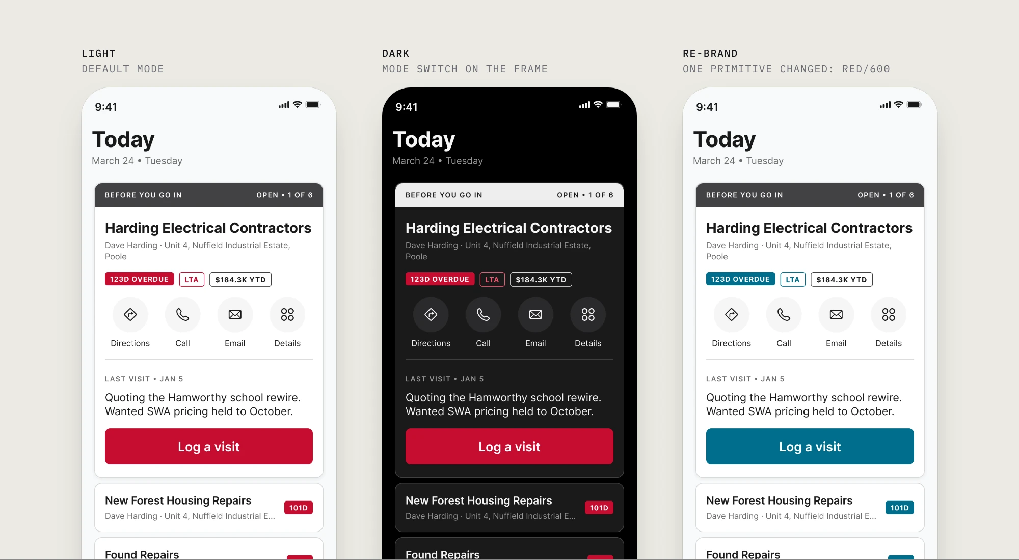
Dark mode is one switch on the frame; no screen was redrawn. A re-brand is one primitive: change red/600 and every button, badge and highlight follows. Before the system, the same change meant finding 119 hand-typed reds.
09 Results
The CES system is in production across the portfolio, and I’m no longer required in the room for most decisions about it. Diary Manager is a concept: its numbers come from scripted audits of the same ten screens before and after, and the Swift package is a working handoff, not a released app.
10 What I’d do differently
Build the case before the system. At CES the pilot was finished before anyone outside design saw a number, so I spent the first month proving something I could have gotten agreement on in a week. Now I bring the evidence first.
Start the tokens with the first screen. Diary Manager was only weeks old and had already drifted. A system set up on day one costs an afternoon; one added later costs an audit.
Write the conventions down, and check contrast at the token. Naming is invisible until someone shows you, and every contrast failure in Diary traced back to three colors.
What I’d keep: rebuilding one real screen end to end before proposing anything. It worked at CES and it worked here.